


Certification is the Standard. Capability is the Outcome.
We prepare professionals not only to pass exams — but to lead with measurable impact.

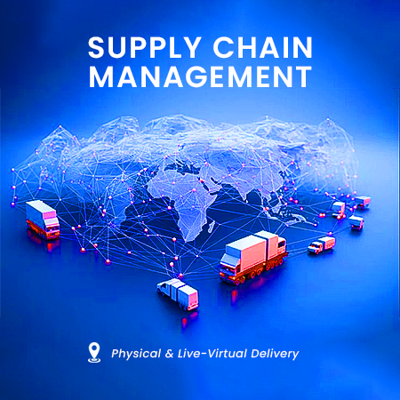
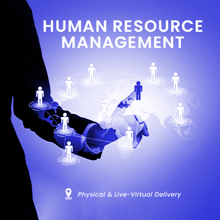
Corporate Capability Development
Tailored programmes designed to strengthen execution, governance and digital transformation across your organization.

SCILS Outscourcing
From Strategy to Execution, while you focus on your mandate.
PMO Setup • Operational Support • Talent Deployment • Business Process Optimization.
Ifeanyi Peter MOLOKWU
, RGS Worldwide
At about 8/9 years ago, I registered for a promo course which was supposed to be a one off training at SCILS but along the ... Engr. AMOO JOSHUA OLUMIDE, HITECH Construction Company Limited
|